

Coca-Cola Refreshes Its Iconic Identity for a New Global Era
A bolder, more unified visual system brings Coca-Cola’s most recognizable design elements to the forefront across more than 200 markets.
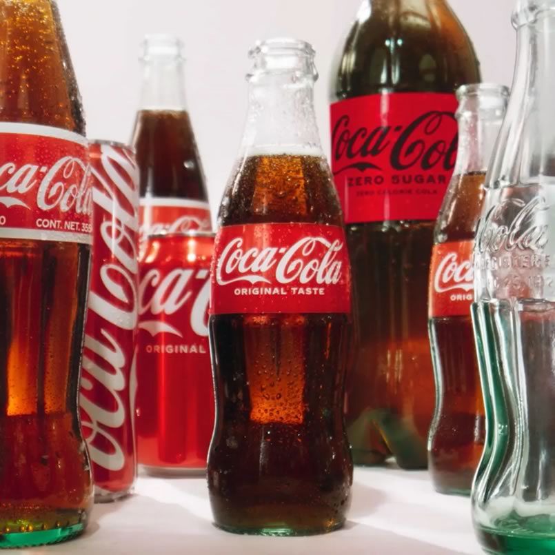
August 22, 2026 — Few brands possess the visual recognition of Coca-Cola. The red-and-white palette, the flowing Dynamic Ribbon, the distinctive Arden Square and the legendary Spencerian script have become visual shorthand for one of the world’s most enduring consumer brands.
Now, Coca-Cola is bringing those elements together under a new global visual identity system designed to make the brand more consistent, recognizable and adaptable across an increasingly fragmented consumer landscape.
Announced by The Coca-Cola Company on July 20, 2026, the refresh represents less a departure from Coca-Cola’s heritage than a deliberate sharpening of it. The company says the new system is built around a simple strategic principle: every Coca-Cola execution should look and feel unmistakably Coca-Cola.
The rollout is underway across Latin America, Europe, the Middle East and Asia, with the new identity extending across packaging, retail environments, equipment and digital experiences.
Building on What the World Already Knows

Coca-Cola’s greatest visual assets are also among the most familiar in global popular culture. Rather than replacing them, the new identity system places greater emphasis on them.
The company’s signature red-and-white color palette receives renewed prominence, while the Dynamic Ribbon becomes a more powerful graphic device. The Arden Square and Spencerian script are likewise being elevated within the broader system.
The approach reflects a central challenge for global brands in the digital age: how to remain instantly recognizable while appearing coherent across everything from a refrigerator in a neighborhood store to a smartphone screen thousands of miles away.
Arnab Roy, President of Coca-Cola Global Category, described the refresh as an effort to create greater clarity and consistency while continuing to evolve the brand.
“Coca-Cola is one of the most recognized brands in the world,” Roy said, emphasizing the responsibility that comes with that recognition. The objective, he explained, is to build on the elements consumers already know while creating a stronger foundation for future growth.
That distinction is important. Coca-Cola is not attempting to reinvent its visual language. It is refining and systematizing it.
One Brand, One Visual Language
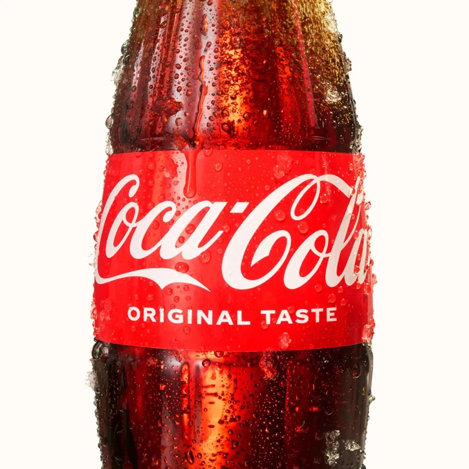
The new identity arrives at a time when major consumer brands increasingly need design systems that can work across an extraordinary range of physical and digital touchpoints.
A bottle or can, vending machine, restaurant display, retail shelf, website, social-media asset and mobile experience all need to communicate the same brand — but each operates within a different visual environment.
Coca-Cola’s new system is intended to provide that consistency at global scale.
Rapha Abreu, Global Vice President of Design at The Coca-Cola Company, described Coca-Cola as a longstanding symbol of optimism and authenticity and said the unified visual identity is intended to create a more recognizable brand experience for consumers.
The significance lies in the word “system.”
Rather than treating individual advertisements, packages, or digital experiences as separate design exercises, Coca-Cola is establishing a common visual framework that can be adapted across markets and formats.
For a company operating in more than 200 markets, that scalability can be as important as the aesthetics themselves.
Coca-Cola Zero Sugar Gets Its Own Evolution

The refresh also extends to Coca-Cola Zero Sugar, although the product retains its own distinctive visual identity.
The updated design draws more visibly from Coca-Cola’s heritage while using contrasting cues to maintain the Zero Sugar proposition. Changes include larger “Zero Sugar” typography, a prominent black Dynamic Ribbon on cans, and a black bottle cap on PET packaging.
The strategy illustrates another aspect of contemporary brand architecture: products within a family need to be immediately recognizable as part of the same brand while remaining sufficiently differentiated to communicate their individual proposition.
In this case, the familiar Coca-Cola design language provides the foundation, while black becomes a stronger visual signal for Zero Sugar.
Design Meets Technology
Perhaps one of the more consequential aspects of Coca-Cola’s announcement is what sits behind the new visual identity.
To support the rollout, the company has introduced an immersive Brand Center together with technology-powered Design Intelligence tools.
These resources are designed for Coca-Cola’s internal design and marketing teams as well as its global network of agency partners.
The objective is straightforward: ensure that a brand system this large can be implemented consistently without becoming rigid.
That is a considerable challenge. Global brands must balance central control with local relevance, allowing regional teams and creative partners to adapt campaigns to different cultures, languages, consumer behaviors and media environments.
Technology-assisted design governance could therefore become an increasingly important part of how multinational brands protect visual consistency.
Evolution, Not Reinvention
Coca-Cola’s approach offers a broader lesson.
Iconic brands face a unique paradox. Their greatest assets are often the very elements that must remain stable, yet consumer expectations and communication channels are constantly changing.
A radical redesign risks sacrificing recognition. Too little change can make a brand appear stagnant.
Coca-Cola’s answer is to move between those extremes.
The company is retaining the visual codes that have accumulated enormous recognition over decades while reorganizing them into a more coherent contemporary system.
In that sense, the 2026 refresh is less about changing Coca-Cola’s identity than about making its existing identity work harder.
The Power of Recognition
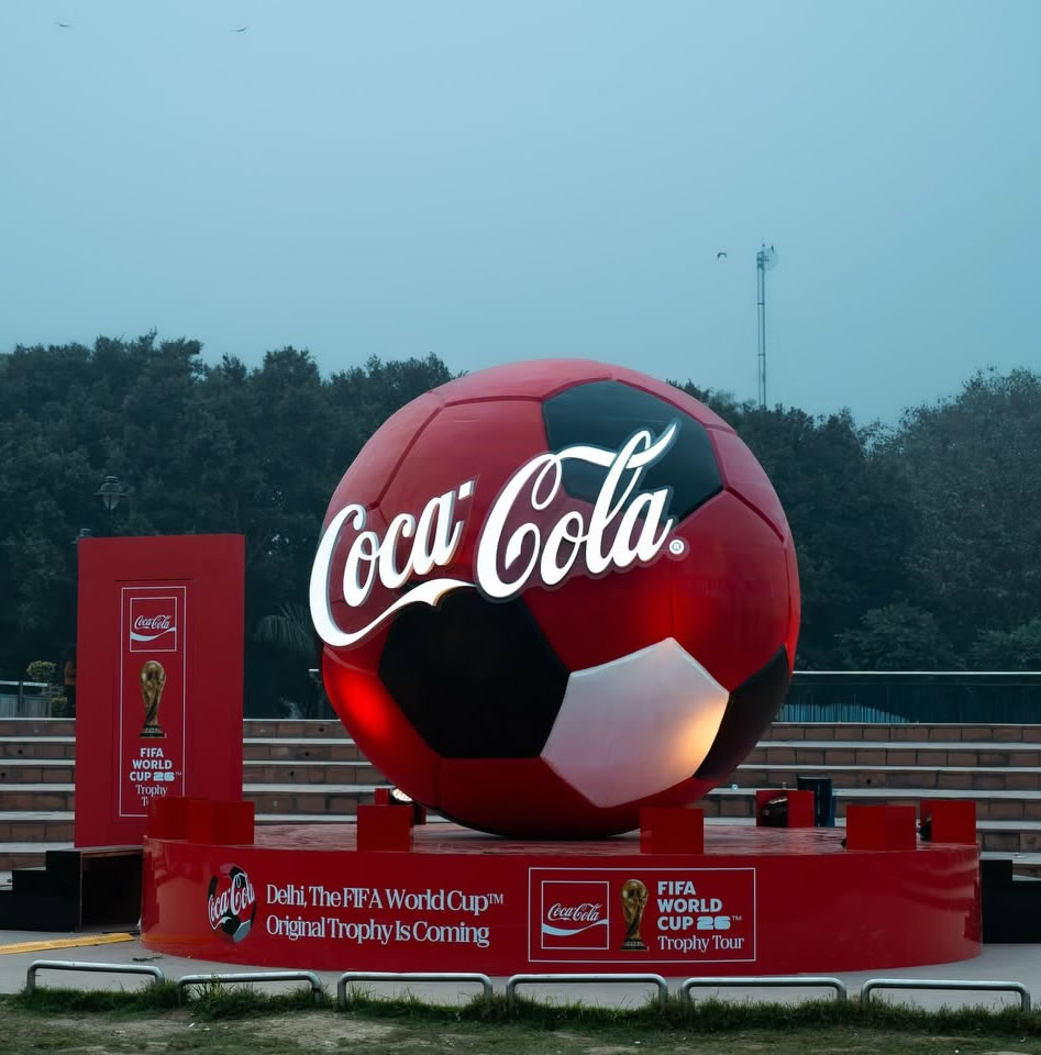
In a crowded global marketplace, recognition has become an increasingly valuable form of brand equity.
Consumers encounter thousands of visual signals every day. A distinctive color combination, graphic element, or type treatment can communicate identity in an instant — sometimes before a brand name is even consciously read.
Coca-Cola’s strategy acknowledges that reality.
The red-and-white palette, Dynamic Ribbon, Arden Square, and Spencerian script are not simply decorative elements. Together, they form a visual vocabulary that can identify Coca-Cola across languages and markets.
By placing those assets at the center of one global system, the company is betting that greater consistency will translate into greater memorability.
A Familiar Coca-Cola for a Changing World

Coca-Cola has spent more than a century building one of the world’s most recognizable brands. Its latest visual refresh demonstrates that maintaining an iconic identity does not necessarily require abandoning its past.
Instead, the company is giving its most familiar visual ingredients a more unified role across the modern consumer experience.
As the rollout expands across Latin America, Europe, the Middle East and Asia, the new system will ultimately be judged not simply by how different Coca-Cola looks, but by how effectively it makes the brand recognizable wherever consumers encounter it.
For Coca-Cola, the message is clear: the brand’s future begins with making its iconic identity even more unmistakable.
Coca-Cola Icon

